Saturday 26 July 2014

The Fear Factor - Using Quindell PLC as an example.

Good afternoon traders and investors,


I've discussed before what I think is a level of spectacular value for money that Quindell offers at the moment, so I don't intend on giving anymore points to support my strongly bullish view on this stock. I am also going to ignore the manipulation theories for the sake of this article, even though in reality I think they make a sound and plausible point. I do however wish to focus on and discuss the concept of fear in the stock market, using Quindell as a my primary example. The main three ideas I'm going to discuss are points which, if acknowledged, can be used to not get sucked into selling in a state of fear, but more importantly can be used to make great trades.


1. Markets overextend expectations:


- This is not a new idea by any stretch of the imagination (in fact I nicked it from Richard Farleigh - my trading role model!), but it's a very important factor when considering the nature of stocks that are hit by a fear-mongering attacks, such as Gotham City's attack on Quindell.


This point applies both ways in trending markets too: take the Australian government bond market in the late 1980s and 1990s which saw falling interest rates from 1989-1993, causing falling ten-year bond yields from 14% to 7%.


- Stocks that are hit in this way by a fear-mongering attack (Gotham City Reports - Quindell plc) will as a result often take much longer to recover than people expect them to and a large portion of this comes down to fear in the market. In the case of Quindell the market was very quickly made aware of the fraudulent nature of Gotham City's claims, but yet the price continued to fall - a clear sign of fear in the market regarding Quindell combined with dubiously moral money management techniques (loading the bid to hold prices down, rinse and repeating by short sellers, etc).


To summarise this point: assets always takes significantly longer to recover from falls than people expect.


2. Patterns and Anomalies always exist:


- Quindell falls strongly into the 'anomalous' category at the present time for numerous minor reasons, but with the main reason being that the fundamentals of the company simply dictate a significantly higher share price than is currently being expressed by the market.


Crisis situations will regularly provide strong imbalances in supply and demand that cause great bargains to be had if your risk management is correctly followed. Take private equity for example, which always takes a big plunge when the global economy is hit (for example, 9/11 or the emerging market crisis in the late 1990s) because it's inherently illiquid and also because smaller markets are less watched by investors, meaning they take significantly longer to bounce back from major falls. The imbalance in private equity prices in the 1987 stock market crash created huge opportunities for many investors in that sector, which aloud them to yield such huge gains - in short they did their homework on the companies and saw there was a strong imbalance between the current company valuation and the true company value.


This continues on from my first point, that markets tend to overextend expectations, in this case regarding how low Quindell's share price has fallen, but also how long it has stayed so low. This is when common sense kicked in for me as a trader and since about a week after the Gotham City attack on Quindell, I have held stock in the company, because in my eyes this is simply an anomalous period for the company and one that can be profited from.


- Understanding whether you're looking at an anomaly or not requires asking oneself what comparative advantage you have against the market (obviously you must think you have some edge or you would never profit from trades and investments).


In the case of Quindell, my comparative advantage (which is the advantage of many who are strongly behind the company) is that I understand the company and have done so much research into its earning profile (please see my post on understanding Quindell and its dividends: http://themaskedaimtrader.blogspot.co.uk/2014/07/quindell-plc-frustrating-but-stay-with.html), that I believe I have an advantage in the medium to long term where the noise of short term price movements are excluded.


It's also worth remembering here that you don't have to have a huge advantage over the market to yield large gains. Take casinos for example, which rely on a very small percentage advantage when customers play roulette and other games, where on average the casino will only win 55% of the time. It's this small advantage I believe that I've got in truly understanding the company, that makes me believe I have the potential to yield strongly from Quindell, especially in this currently anomalous period for the company.


3. You're unlikely to out-analyse the analysts:

- This is pretty much stating the blatant obvious to an extent, as most people aren't full time traders, but it's an exceptionally important point when a stock begins to behave anomalously and especially when looking at smaller companies that are rarely tracked by large brokers and analyst firms.


To continue using Quindell as an example, the most recent analyst ratings are as follows:

Canacord Genuity: 362p
Daniel Stuart: 1005p


In the case of Quindell these firms have an extra advantage over the private investor because they are often in direct contact with members of Quindell and therefore simply have a greater level of information available to them to base their predictions on. Furthermore, professional analysts normally only have five to six companies to look after in their portfolio, meaning that a huge proportion of their time overall spent with these companies (at work and at home), so they're consequently always aware of the company specific updates and the further market issues that impact the companies under their belt.


With Quindell in particular, this means understanding that claims against companies for industry induced deafness have increased by two thirds since 2012 and that this will positively impact upon the company. It also means that analysts will understand that insurance companies are making a drive to increase their telematic insurance base, thus out-pricing those without the devices over the next ten years.


Therefore, I often trust the analysts strongly over a medium to long term period and I'm especially confident when two firms put out targets that correlate.


Overall, the these three ideas are points which can be used to assist when the market pricing of any asset becomes anomalous. I think that all three ideas can be strongly applied to Quindell under the current circumstances and moreover, I believe that in these anomalous circumstances it's important to regularly assess your positions and double check that your opinion remains as it was on the purchase of the asset.


Enjoy,

The Masked AIM Trader.

Friday 25 July 2014

Regency Mines - What Horse Hill can add to an already strong portfolio:


Principally focused on the exploration and development of mineral resource deposits, Regency Mines (RGM) currently has four main projects underway: Scouting for nickel in Papua New Guinea and Kenya; copper and other minerals in Australia and agro minerals in Sudan.


Their flagship project in Papua New Guinea covers 245 potential square kilometers of nickel, with the further possibility of striking copper or gold on that same site. The company’s main interest in Australia consists of three tenements with an area of 271 square kilometers in the Fraser Range area. It also operates a mining finance and technology arm and maintains a variety of listed and non-listed holdings in the mineral resource space.


Understanding Horse Hill’s position in their portfolio:


However, if this diverse and financially compelling portfolio isn’t already good enough for you, it may be worth looking into their latest investment: a 5% direct stake in the Horse Hill Oil and Gas project.


A grouping of mining development companies are currently working together to exploit the 2,646 meter stacked oil and gas well. With an upside potential of 671 million stock barrels (“MMSTB”) of oil in place with an expected total mean recoverable prospective resources of 87 MMSTB this project seems strong. An additional 456 Bcf of natural gas (mean 164+ Bcf recoverable prospective resource) makes the project somewhat stronger. Expected to spud in late July/early August, this project is likely a great short to medium term buy, and with the further hedge of the extra mineral development projects in Regency Mine’s portfolio that are expected to spud soon (to be outlined shortly), your risk is hedged very effectively in the short term when opening a long position here.


Regency Mines would seem to be the best choice of all of the companies involved in the Horse Hill project in terms of a risk to reward basis for a number of reasons:


This particular oil field is hardly unknown, it has been explored for oil and gas for over sixty years. The producing brockham oilfield is only seven and a half kilometers away, so due to this close proximity it is highly likely that there is a significant well of oil and tests so far have been positive in outlining this too.


Regardless of the Horse Hill project exposure, the company has great future prospects as it is, due to its on going projects in Papua New Guinea and Australia, so if a spud at Horse Hill is at all disappointing (statistically unlikely), their portfolio is diverse enough that is would have little net effect to the overall company, especially remembering that this is still only viewed as a sideline project by many investors.


In other words, both the marginal indirect position Regency Mines has in the Horse Hill project, via Alba Mineral Resources (just under 0.75%), and the position it holds directly in the project (5%) are in total (just under 5.75% of the project's total exposure) self hedging through a high level of diversification in the total portfolio


Therefore the diversified resource portfolio goes a long way to remove the risk in the Horse Hill project, but the reward that Regency Mines has access to is actually magnified by the stake Regency Mines holds in Alba Mineral Resources (14.87%):


Due to Alba Mineral Resources having the lowest market capitalisation of the companies involved in the Horse Hilll project, it means that in relative terms to the other companies involved in the project, it also has the highest price volatility (and therefore market capitalisation upside) on a successful oil spud.


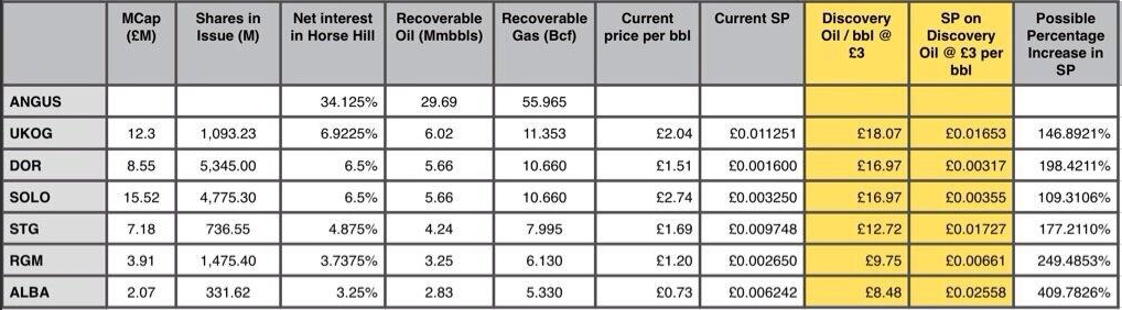
This is a point that was discussed by a professional in the oil and gas sector who posted an interesting table on his Twitter feed (https://twitter.com/ABMckinley):
Twitter Table.jpg


While the whole table is highly interesting (albeit somewhat inaccurate now as a result of share price changes since the table’s creation), it clearly shows the high upside potential in both Regency Mines and also in Alba Mineral Resources. This means that the effective potential upside could be much more like this:


Regency Mines acquire 14.87% of the increase that Alba Mineral Resources would achieve on a successful spud (because they own 14.87% of Alba Mineral Resources), meaning that the marginal increases as a result of having an indirect stake in the project via Alba Mineral Resources yields a potential 60.96% further increase in the share price of Regency Mines on a successful spud (assuming that Alba does rise by 410%). This effectively means that in raw terms (from a share price of 0.265p - that our professional oil and gas friend on Twitter calculated), the real upside on a successful spud at Horse Hill is the sum of Regency Mines own potential percentage gain in the project with the marginal gain from Regency Mines indirect stake in Alba Mineral Resources:


249.48%+60.96% = 310.44% potential upside


Granted, there are probably significantly more sophisticated ways of doing a similar calculation, but the result that’s gained illustrates how Regency Mines has in my opinion the best upside to downside risk reward ratio.


Other Portfolio Components:


It is also engaging to note that Regency Mines further investments seem to have recently become exciting. Not long ago a report was released on the Fraser nickel drilling programme in West Africa. The main points tell us that the reconnaissance aircore drilling has ceased and the results are being processed to refine the programme's priority targets. Experts are being contracted from companies such as southern geoscience to locate possibly intrusive bodies and to pinpoint the location of nickel sulphate seams.


The project is being overseen by mining company Ram Resources (ASX:RMR), a company that Regency Mines has a 7.35% stake in. As well as this Regency Mines has a 5.6% carried interest in the Fraser project. In conclusion, Regency mines has a moderate exposure in this project, that “will generate strong news flow over the coming weeks and months, culminating in deeper drilling at what are emerging as very promising targets.” (Bill Guy, Managing Director, Ram Resources). The combination of strong newsflow and promising targets, described over the time scale of a matter of weeks will likely equate to great hype over this stock.


The other components of Regency Mines’ portfolio continue to be successful too: Red Rock Resources (LON: RRR) which is 9.80% owned by Regency Mines has recently applied (along with partner companies and contractors) for mining permits in Kenya post promising exploration for gold seams. Red Rock Resources controlling roughly 30% of possible revenue from this project, it’s inevitable that cash will flow back to Regency Mines.


Along with Red Rock Resources, Regency Mines has a 6.93% stake in Direct Nickel Limited (ASX: DIR), who have recently developed breakthrough metal ore processing technology with an unrivaled efficiency and a tiny necessary processing plant size in comparison to the current technology. Now would be a good time to remember that Regency Mines holds a large scale laterite deposit with the licences to the metals that the ore comprises. When we add two and two together we can realise that there must be a plan here utilizing the combination of the above. The best we can hope for would be a large scale mining and processing operation, with the worst case scenario being that Regency Mines finds the ore, pinpoints priority mining targets, and then sells on the land and licences to another mining company. The likelihood of failure from this opportunity is minimal because Regency Mines has the very latest technology and expertise with the partnerships to bring an opportunity like this forward. The future outlook from this network of companies is fantastic.


With the strong risk to reward ratios you can see from Regency Mines, we see this as a great opportunity for a short term trade or a medium term investment. The potential for great short term growth, with the expected long term success of the company makes this a perfect stock for a range of investor types. The newbie investors out there could grab a relatively low risk stock (for the sector) with good future promise that is still flying under the radar somewhat, while the longer term investors can take a position in a company with expected long term growth and can be reasonably sure of themselves that their money is in safe hands.


Regency Mines will only stay under the radar for so long, with the strong numbers it has the potential of generating. I’m especially impressed by the way in which the company is self-hedging with its highly diversified portfolio of investments, but moreover I feel that in the short and medium term the soon to spud Horse Hill project, showing newly calculated figures of 310.44% potential upside on a successful oil strike, could make Regency Mines a great buy in both the short and medium term.

Sunday 20 July 2014

Understanding Ratios - definitions combined with pros and cons (a continually updated post).

Good afternoon traders and investors,

This is going to be a bit of a long post, but I hope that I can use it as a way of consolidating the positives and negatives of some popular terms (mostly multiples) that get chucked around financial markets:


1. PE Ratios:


- This effectively asks the question "is this stock is cheap or expensive?"


- It's calculated by taking the current share price (P) of a stock and dividing that figure by the earnings per share (E). Symbolically it's shown as P/E.


- For example: Tesco currently have a share price of 284p and an earnings per share of 23.72p:


284p/23.72=11.9


- This means that if you buy some shares in Tesco right now, you'll be paying 11.9 times one year's earnings, or if you buy some shares at 284p and the earnings per share doesn't change it will take you 11.9 years to make back your invested capital (let alone make any extra - in theory - EPS is not the same as the yearly dividend).


- Now, this number doesn't mean you should either buy or sell Tesco yet, because in order to make some sense from it we have to compare it to some other companies in the same sector (yes, you could argue that Tate and Lyle are in different sectors, but the wider sector all three companies are in is Non-cyclicals):


Sainsbury PE=8.7
Tate and Lyle PE=2


- Well, if Sainsbury has a lower PE ratio than Tesco than it perhaps makes Tesco look a bit expensive and if Tate and Lyle have a PE ratio of 2 than this makes both Sainsbury and Tesco look expensive. However, just because a company has a low PE ratio doesn't mean you should buy it. For example, there could be other things going on there which will make the current PE ratio somewhat artificial:


- PE ratios don't factor in the market capitalisation of the company, so you could end up getting a great PE ratio, but terrible liquidity with a very small capped company (although this risk can be reduced with ensuring that you are indeed comparing Apples with Apples when you run your PE ratio checks).


- PE ratios don't say anything about risk, so it could be that Tate and Lyle have a low PE ratio as a result of their high risk that the market have priced into the company (they could have very high levels of set for example).


- PE ratios are based on hindsight, so just because a company has a low PE ratio doesn't mean that another company with a higher PE ratio will not quickly over take it with better earnings per share growth and thus end up with a significantly better PE ratio. This can be checked out by looking at the earnings growth rate, which will help to give guidance.


- PE ratios tell us nothing about dividends and or if the company can actually turn this earnings per share (not what the company actually pays as a dividend) into positive cash flow (with which they pay dividends).


2. PEG Ratios:


- This is like the PE ratio's older brother and just like the PE ratio asks the question "is this share cheap or expensive?" and carries the assumption that people buy shares because they intend to squeeze future earnings out of it (i.e. in theory, a property investor views a house as only as valuable as the future rental income that can be generated from it).


- It's calculated by taking the current PE ratio of a stock and dividing it by the earnings growth rate (EGR) of that stock/ So symbolically we get a formula of PEG= PE/EGR.


- Quite a lot of people tend to prefer this to the standard PE ratio because it factors in the fact that you would hope as an investor to see an increase in earnings per share growth over time (or earnings growth rate). It's worth stating now that earnings growth rates you'll either need to calculate yourself or look online for analysts that have already done it for you.


- For example, let's take Morley Beswick's Stationary Supplies (a company I've just made up so I can use conveniently round numbers):


PE ratio = 10
Earnings growth rate (10p------> 12p)= 20% (leave the '%' part out)


PEG=10/20
PEG=0.5


- Now, a PEG ratio tells you the following (in theory):


PEG=1 the share is fairly priced (or mathematically this would be a PE of 10 and an earnings growth rate of around 10%)
PEG<1 the share is priced cheaply in the market
PEG>1 the share is priced expensively in the market


- The issues with this are that the primary source of data comes from earnings forecasts from analysts, which are notoriously inaccurate. So, before taking a PEG seriously we have to sit down and seriously question the earnings growth rate.


- This also tells us nothing about the dividend or cash-flow (can the firm turn the growth into cash?) and for some companies that are in slow growth sectors like non-cyclicals, actually a PEG ratio probably would be inappropriate because of the sector low EPS growth rate.


3. Dividend Yields:


- This effectively tries to use the income paid by a company and the current share price to give you a return figure as a percentage on your investment (dividend yield).


- It's calculated by taking the dividend and dividing that by the current share price and multiplying that figure by 100%. In symbolic terms it would look like this:


Div/Share Price*100%


- For example, let's say that I buy some shares in Richard Handler's company that makes a similar product to Viagra, we'll call the company Dixafix. Dixafix's share price is currently 580p and their interim and final dividend combined (total dividend) is 30p.


30p/580*100%= 5.1% - or a return of 5.1% in a year.


- Now as with PE ratios, whether this is good or not depends on what else you can do with your money. If you can get 10% from a bank account for almost no risk than that makes 5.1% look pretty bad. You could also shop around through corporate bonds and see what's available there. Comparison is key.


4. Dividend Cover ratio:


- Dividend cover is the idea that of all of the profits that a company makes in a year (let's say £100m), the board of directors won't decide to pay out all of that as a dividend, but will hold some of it back so they can continue to grow the business organically. It effectively asks, "is this dividend yield sustainable?".


- It's calculated by dividing the total earnings per share by the total dividend per share in one year (and then normally followed by multiplying by 100%).


-First we need to have a dividend yield for our example:


total dividend per share/current share price *100%


I have a company with a silly name (Spruce Spring-clean, let's say). I am going to release a dividend of 2p per share. The current share price is 10p.


To derive the dividend cover we therefore take 2 (the total dividend per share) and divide it by 10 (the current share price) and we get 0.2. Multiply 0.2 by 100% and we get our dividend yield of 20%


- Let's work out the dividend cover:


Helpfully, Spruce Spring-clean had an earnings per share of 20p.


so, we take our total earnings per share (20) and divide that by our current share price (2) = 10


- What does this mean?


Well, it means that this divided could have been paid out ten times before they would have run out of profits (in one year) to pay the dividend with. On the face of it, the higher the dividend cover is, the better the company is and generally though a dividend cover of two or more is a good company to go for.


5. Payout ratios:


- Payout ratios are effectively a reworking of the dividend cover calculation, and asks the question "what proportion of the total earnings per share was paid out as a dividend?".


-It's calculated by dividing the total dividend per share by the total earnings per share and then by multiplying by 100% to make life a little easier:


total dividend/ total earnings per share *100%


- To make life easy we can continue from the dividend cover's example and have a dividend of 2p per share and an earnings per share figure of 20p.


2/20= 0.1 (*100%) =10%


- Generally speaking a high dividend cover is pretty good (with 10% in this case looking low and 30-35% being pretty normal for a standard blue chip stock) because statistically they're reasonably consistent and show that cash is being returned to shareholders.


- Payout ratios tend to come into their own when they're combined with dividend yields and covers. For example, a low payout ratio combined with a reasonable dividend yield and a strong cover could well indicate that the company in question is going to increase their dividend yield substantially in the future.


6. Price to Book ratio


- Once again this asks the question "is this stock cheap or expensive?", but it asks it in reference to the book value of a firm's assets.


- Here's how it's calculated:


share price/ book value per share


- Understanding what this ratio tells us is very important (otherwise I could pull any random number out of the air and use that to invest). Now, the share price is the easy bit to understand (the closing price of a stock), but the book value per share is a little more difficult to get to grips with. In effect, the book value per share looks at what the company owns (it's total assets) and the company's liabilities (who it owes money to) and then works out a net asset position by taking their total asset figure and taking away the total liabilities figure.


- For example, let's pretend I have a house that cost £150,000. I may own £50,000 of that, but the bank I took out a mortgage with will own the other £100,000 of the house. So I have a net asset position of £50,000 (the total asset - the liability): 150,000-100,000.


-This net asset value is then divided by the total number of shares (you'll have to look this up online) that the company has issued to get a book value per share.


- Let's do a full example:


Morley's Piratical Provisions (a hypothetical shop that sells pirate themed food) has a book value of £14,681m (the 'm' means 'million' for those who don't know).


The total number of shares issued is 7,985 million shares.


The current share price is £4.30.


- So, we need to start by taking the book value (£14,681m)  and dividing that by the number of shares (7,985m) to get a book value per share:


14681/7985 = 1.84


Now we need to take the current share price (£4.30) and divide that by the book value per share (1.84):


4.30/1.84 = 2.34


- When the price to book ratio is well above 1.0, it's generally accepted that you're paying a lot for shares, because (to use our example above) the current share price is over twice what the company's assets are actually worth.


- If the price to book ratio is less than 1.0 it means that you're getting a good bargain, because actually you're paying less for the shares than the assets of the company are actually worth.


- Now, to tell if this number is good we have to compare the price to book ratio of Morley's Piratical Provisions to that of other companies in similar sectors (for example, ''Dead Men Sell No Snails'' - the anti-French, pirate equivalent of Tesco), which has a price to book ratio of 4.3 - making Morley's Piratical Provisions look pretty good.


- There are a couple of disadvantages with price to book ratios however:


- The nature of accounting rules means that assets can be discounted and intellectual assets are subjective somewhat to how they're valued - meaning you could look at a balance sheet and think something is worth more or less than is actually stated. Other issues can be that in accounting terms you pretty much can't value something as an asset unless someone else has paid a certain price for something exactly the same elsewhere before - hence why football clubs can't list home grown talent as an asset on their balance sheets.


- The other issue is simply that some companies (especially small tech companies) tend to have very little in the way of actual assets, making this ratio meaningless at best and utterly inappropriate to use at worst.


7. Price to Sales Ratio:


- This is a bit of a "meh" ratio in my opinion, although many people do love it, and it (as with the other ratios) asks the question "is this share cheap or expensive?".


- It's calculated like this:


Market Capitalisation/sales (over 12 months)
or
current share price/sales per share


- The first one is often easier to do.


- Here's a pretend example:


I have a company called "Cleftomaniac", which sells music related products. The company  has a market capitalisation of £80m and had twelve monthly sales last year of £100m.


So, to work out the price to sales ratio we just divided the market capitalisation (£80m) by last year's total sales of £100m.


80/100 = 0.8


- Studies have shown that when price to sales ratios are below 1.0, future upward share price movement tends to be strong and vice versa. So, below 1.0 is cheap and significantly above 1.0 is expensive.


- Fans of the ratio say that not only is it simple to calculate and interpret, but that the fact that you're using sales, makes it very hard for the company to manipulate it's accounts to show preferential figures. Also, it's a good ratio to apply to smaller firms that are growing very quickly, which may have little or no profit, as they will almost certainly have positive sales figures (if they don't I would seriously rethink why you're investing in them).


- The problem however, is that it ultimately isn't a substitute for the PE ratio, which people were particularly fond of using in the ".com boom", because it could make a company look great even if in reality thee was little to no actual profit being generated. In short, sales are not a substitute for profits!


- Another big issue I have is that it in certain sectors that are asset intensive this ratio is a bit irrelevant (a price to book approach is more appropriate) and the same point applies in financial sectors where they report revenues a bit differently to other sectors.


- The other issue is that you can get caught in a debt trap, whereby the market is worried about the company's debt - something that the price to sales ratio doesn't explicitly deal with. In other words, you can have a price to sales ratio of 0.3 and the company could still carry a high risk of going bust three months later (although this could be calculated by using an enterprise value figure instead of a market capitalisation figure).


Saturday 19 July 2014

Quindell PLC - frustrating, but stay with it!

Good afternoon,


Quindell PLC is in doubt one of the more frustrating shares that I've traded and invested in. I used to trade the company reasonably actively, but now I've moved it over to my long term pension portfolio (disclaimer - I own shares in the company). Regardless of how annoying the longs may find it, I still believe that it's definitely worth sticking with.


Quindell winds people up (shorts and longs) for any number of reasons (I am going to get to the good part):


1. Quindell is a religion:


- I've met very few people who trade or invest on AIM for a living who don't have a very strong opinion on Quindell. This is understandable when you consider that some will have been in Quindell since the low levels of 3p and consequently will have effectively watched their stock market baby grow up and get their degree from Oxford, while others will have gotten in a little late to the party at 30-40p and be highly frustrated with their losses.


- Then you have the shorters, who will use any tactic they can to push the price lower and they will almost always succeed with this practice int he short and medium term, because people tend to act brashly in response to fear - hence why bear markets will almost always last a lot longer than people expect them to.


2. Quindell is still volatile regardless of consolidation:


- For those of you who've read my article entitled: Quindell PLC Post Consolidation - 


http://themaskedaimtrader.blogspot.co.uk/2014/06/quindell-plc-post-consolidation.html 

- you may be able to appreciate that there's a certain amount of irony in me stating this, as I'm almost directly contradicting myself.


- In theory, post consolidation we should have seen reduced volatility, however, in reality it's done little to actually improve the situation hugely (although I do think it is still better than it previously was). This leads me to my second bugbear.


3. Quindell is under significant intra-daily support and resistance line bashing by algorithmic trading:


- I'm normally not the type to jump onboard the  "this stock is being manipulated" bus, but what I would say is that having analysed the trades intra-daily, you can see a clear pattern of sells by automated systems, when key support or resistance levels are reached, thus causing further volatility.


- This increased volatility (or not decreased volatility) by automated trades is as a result of each price tick being of a lower relative percentage compared to pre-consolidation meaning that support and resistance levels are not as strong as they once were pre-consolidation. In other words, it's like shooting a bullet through hundreds of pieces of paper rather than a few pieces of corrugated card.


Why should you stay with Quindell then?


In my opinion there's pretty much only one thing we need to know and a load of others that help us to pacify our worries (see the trading update out on the 14th of July):


The dividend cover for the first year of dividend payments (2013) was 25.35, on a total dividend of 0.1p per share.


While this is a pretty simple number to look at, it tells us a few very important things and effectively asks the question "is this dividend yield sustainable?":


1. A dividend cover of 2 or more is seen as pretty good.


- With a dividend cover of over 25x, for an equal dividend to be released the answer is certainly yes, that yield is sustainable, but this point actually gets better, because it means that if the Quindell board of directors were to double dividend payout, you would still have a cover of 12.675 and if they quadrupled it you would have a cover of 6.3375.


2. Now, based on the trading update we saw on the 14th July I think we can take out the following points:


 - Adjusted EPS of circa 30 pence up 82% (H1 2013:  16.5 pence)
 - Basic EPS, EBITDA and Profit Before Tax are all expected to be ahead of their respective adjusted numbers.


- This means that we can probably assume an earnings per share figure for the year end of around 70p, which is pretty good for a company with a share price of around 190p. 


- However, we can turn the dividend cover on its head and turn it into a payout ratio (EPS/DPS), which gives us a number for 2013 of around 4% - which is tiny!


- This means that if we factor in a very high dividend cover and a very low payout rate there's a lot of potential movement upwards in terms of future dividend yield.


- Now, I'm not going to put a number on what I think we can expect to yield from Quindell with the next dividend, but it looks like we could expect strong dividend growth for the future and when we combine this with the current PE ratio of 6.7 Quindell continues to read as an exceptionally good book.


Good luck traders,

The Masked AIM Trader

Index futures - real or nominal value charting?

Good morning traders and investors:


Today I'm going to look at something a little specific, but don't let that stop you from reading, because it will be food for thought for those of you that trade index futures.


When you open up your SPX futures in the morning (or at 14:30 in the afternoon if like me you're in the UK), do you ever stop to think about the impact of the nominal figures that you're trading against the real figures of the S&P500 (using a CPI inflation rate).


Now, whilst I appreciate that you can't actually trade SPX in real terms (iShares are yet to offer us an ETF that exposes you to real rated indexes), we can use it in comparison to the nominal value of the SPX to illustrate a true down trend (and therefore increase in value available to investors).


For example, let's take the SPX as of the close on July 18th 2014 (yesterday):


1. We had a new nominal record close for the S&P500 of 1978.22

2. The equivalent record close for the S&P500 in real terms however would be just under 7% higher than it currently is in nominal terms.


That's great, but what does this actually mean?


Well, for those who are prepared to do some data trawling, you can uncover some pretty useful trends when comparing the real and nominal index values:


1. A nominal upwards drift combined with a real down trend tends to result in a increase in equity value or a fall and consolidation in trailing P/E ratios. For example, 1966-1982 saw this trend in the SPX and by the end of the trend you could get a trailing PE of 6.6


2. You need to be very careful when buying into the stock market. Yes, this is stating the blatant obvious, but if you have bought into the SPX on in the secular bear market of 1966-1982 you could have gained almost 9% nominally and lost almost 65% in real terms.


I hope this is food for though for some of you,


The Masked AIM Trader

Wednesday 16 July 2014

Regency Mines Plc - Where we're it's likely to go in the short term.

Good afternoon fellow traders and investors,


Today we're going to have a brief technical look at Regency Mines (RGM) another one of the little known AIM companies that tend to rocket up when no one is looking in their direction.


Regency mines is strange in that it's actually looking very strong presently on a technical level and a fundamental level:


Technicals:


1. MACD


- The MACD line was certainly given a good boost in the positive direction over the last two trading days (15th and today -16th) with the MACD line looking like it's beginning to move up towards and above the EMA.


- From my personal experience with AIM, the larger tick sizes mean that if you wait for the MACD line to actually cross the EMA, you've usually missed a tick or two on the bid, which in some cases can amount to large percentage gains. Consequently, I tend to make a position when the MACD line starts to level off and then reserve capital to average down slightly if I've timed it wrong.


2. KDJ


- The KDJ line is actually pretty low for a company that's had gains of 39% over the last four trading days. This suggests to me that there's likely a lot further for this rally to go and with the K line having just crossed over the D line at 23.56, this stock is currently showing levels dangerously close to the "Oversold" side of the indicator.


- Irony aside, the smart money intra-daily has certainly had a strong eye on RGM as a result of this.


3. RSI


- With an RSI of 49.59, we're seeing pretty neutral levels here, but I would expect the RSI to bounce off of these levels and remain above 50 in the short term, as the buying expressed in the KDJ indicator causes an increase in the RSI.


- A bounce will in my opinion serve as a confirmation of more upside to follow.


Fundamentals:


I never intended to write about the fundamentals on here, as on AIM in reality I don't the ink they matter much of the time (a point for another blog post), but in the short term it can be summarised with the following lines of the 11th July RNS:


"Heads of Agreement ("HOA") with Horse Hill Developments Ltd ("HHDL") for Regency to acquire a 5% stake in HHDL."


"The well is expected to spud during July 2014 and is targeting a number of conventional stacked oil and gas targets up to a depth of 8,512 feet."


All the best, and good luck!

The Masked AIM Trader.


Tuesday 8 July 2014

Quindell plc - a light musical analysis and morale booster.


I felt that all Quindell share holders needed a morale booster, so enjoy this terribly cheesy and original musical number (by me):

My apologies for any appalling spelling mistakes and or rhymes.

A YouTube link for those with iPads: https://www.youtube.com/watch?v=MHBDKnFXNoU